
quarta-feira, 10 de abril de 2013
terça-feira, 20 de novembro de 2012
Is there still a place for Design in Science?
What do we expect when we talk of design in Science? Is it about improving the way labware is made ? Is it possible to improve upon its design?
As of today, most labware already seems to have reached its most functional shape.

Is Design only about the way something looks, or also finding another way to do research?
Let's pick glassware as an example, all of it seems finalised, no new ways to design glass probe tubes, erlenmeyer´s flask, beaker, or distillation columns... these are already the best shape for what we expect from them.

Let's pick evolution of distilation columns: Initially it came from a simple boiling/evaporating/condensing system, developed to some more evolved ones where the glassware is calibrated to have enough distillation steps to be able to obtain more and more pre final product.
This is probably the most obvious example where Science and the wanted result shaped the design of the glassware.
2BLzzi655)Q~~_35.JPG)
quinta-feira, 8 de novembro de 2012
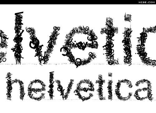
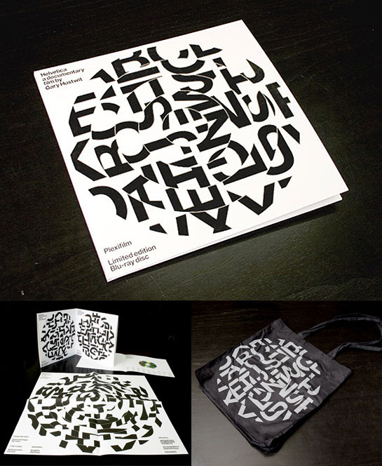
Helvetica: a documentary film by Gary Huswit
Watching commentary and notes.
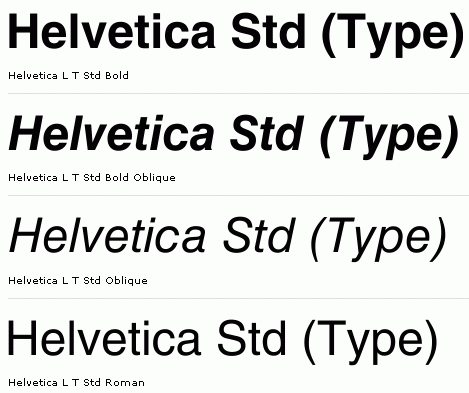
Helvetica was created post WWII, when idealism among designers make them feel some social responsibility. This was emergence of Swiss Style where Helvetica came from. Helvetica is a rational type face and is today the most commonly used by designers.
Helvetica was designed to respond a few criteria:
The type face should be clear, readable, neutral.
Aspects like interrelationship of negative shape, spacing of the letters, the way some letters came from others (the same way space between notes makes music, space between letters makes design).
Helvetica makes the text more accessible, more transparent. It makes a statement: You want to look clear and efficient.

The way something is presented lead the way you react. The way the message is dressed leads the way we read.
Helvetica is a club, a mark of membership.
By the 70's there was a lot of reaction against Helvetica and Corporate Culture, there was a need for change. Hevetica was associated to big corporations, a sign you were in favor or Vietnam War.
Designers began to think types have spirit, they can express all sort of things. They wanted to get free of this clean type. They thought best work comes from emotion. It's not because something is readable it communicates. Sometimes the message just gets lost. Some types more difficult to read may carry better the message.

When Experimental Jetset was created, they wanted Modernism, they stated: As everyone uses helvetica, it's easier to appropiates the style. Helvetica is not a global Monster!

Helvetica was created post WWII, when idealism among designers make them feel some social responsibility. This was emergence of Swiss Style where Helvetica came from. Helvetica is a rational type face and is today the most commonly used by designers.
Helvetica was designed to respond a few criteria:
The type face should be clear, readable, neutral.
Aspects like interrelationship of negative shape, spacing of the letters, the way some letters came from others (the same way space between notes makes music, space between letters makes design).
Helvetica makes the text more accessible, more transparent. It makes a statement: You want to look clear and efficient.
The way something is presented lead the way you react. The way the message is dressed leads the way we read.
Helvetica is a club, a mark of membership.
By the 70's there was a lot of reaction against Helvetica and Corporate Culture, there was a need for change. Hevetica was associated to big corporations, a sign you were in favor or Vietnam War.
Designers began to think types have spirit, they can express all sort of things. They wanted to get free of this clean type. They thought best work comes from emotion. It's not because something is readable it communicates. Sometimes the message just gets lost. Some types more difficult to read may carry better the message.
When Experimental Jetset was created, they wanted Modernism, they stated: As everyone uses helvetica, it's easier to appropiates the style. Helvetica is not a global Monster!
quinta-feira, 1 de novembro de 2012
About Design in Science

The general purpose of this Blog will be to check if there is design in science. I will examine whether if the function creates the shape of the object or if the shape may be independent of the function.
I will also explore how technological developments can influence the design of laboratory apparatus.

By looking at science as depicted in film and television, I will look to see if there is any correlation between the public's imagination and the reality of the lab.
Subscrever:
Mensagens (Atom)